Logos must have a width of no more than 135px and a height of no more than 155px.
Favicons must be valid ico files, or images which can later be converted into ico files, and have a size of 16x16.
Any user may add comments about any of the entries below.
Entries will be accepted until January 17, 2007.
Then the final choice will be made by vote from the January18, 2007 to January 24, 2007. Voting is now active go and vote
IP users have 1 vote, Log in users with less than 2 weeks have 1 vote also.
Log in users with more than two weeks since their first contribution have 2 votes.
Sysops have 3 votes
(only 1 vote maximum per art, This rule only applies to sysops).
Art submitters can only vote 1 time for their art.
Favicon (icon that will appear when saving a link of our wikia) its separate voting but only 1 vote per user/IP/Sysops and it must be indicated that its for the Favicon.
If you change your mind its allow to move your vote to any other place during the Voting time.
If you wish you can fraction your vote (eg 1/2 to one art and 1/2 to another art) your vote if your vote its superior to the ones you have available it will be discarded at the final countdown.
Not signed votes will be remove (so add ~~~~ and you will sign your vote)
Votes should be bolted eg:
1 Vote --Cizagna(Talk) 06:53, 18 January 2007 (UTC)
For the Favicon choose one of the 2 options and sign in
Favicon --Cizagna(Talk) 06:53, 18 January 2007 (UTC)
Description: Has both Dofus and Wiki written out. Features old scroll to give idea of knowledge gathered into wiki. And image of dofus which is the ultimate prize in the game. Used images: Emerald Dofus in wiki and part of wallpaper from Ankama site. -- Fogleg 12:04, 22 December 2006 (UTC)
Comments:
That is beautiful. Nice work. // Peettalk 13:29, 22 December 2006 (UTC)
Plain and simple, I like this one --Cizagna(Talk) 21:47, 27 December 2006 (UTC)
Sorry but the Typo is not perfect, please optimize it when possible...
I see nothing wrong with the font. I'm not sure what the comment above is referring to. This is possibly still my favourite. // Peettalk 22:32, 29 December 2006 (UTC)
This is my favourite by a long shot, simple, clean, fresh and a great typeface. Only change I would make is to the word wiki, make it a brown colour. --Djrikki 05:42, 30 December 2006 (UTC)
One of my top contenders. Like the use of main Dofus icon and scroll background (symbolizes knowledge) but am not 100% sure about the font. ilmarine
Votes for Scroll with Dofus
1 Vote --Cizagna(Talk) 06:58, 18 January 2007 (UTC)
Description: Soft, round and green. Has both Dofus and Wiki written out. It reminds perhaps badge or something. Used images: Green Dofus image and leaves taken from Ankama wallpaper. -- Fogleg 12:04, 22 December 2006 (UTC)
Comments:
Looks nice, but the quality of the graphics is low (you can see how the circle is made of pixels easily) --Cizagna(Talk) 21:47, 27 December 2006 (UTC)
I think it looks really nice for an Atari game, like Pitfall xD no offense, it just made me think of Pitfall.. you should consider better graphics ^^" [Kov]
Description: Simple and clean. The combat icon to remind that there is a lot of fighting to do in the game, also the horns should show that many monsters are waiting. The icon features same sword image. Used images: Close combat icon and picture of horns from the game. -- Fogleg 12:04, 22 December 2006 (UTC)
Comments:
The problem with this logo is that Dofus its not only about fighting, you also have professions; some people only play to level their professions. The horns give the idea of a "devil game". The favicon its very nice combination --Cizagna(Talk) 21:47, 27 December 2006 (UTC)
This is very nice, but the fading its awful. It should be inverted, instead of the white going inside the circle. The gray portion in the background might be a shadow... in which case it would either be better to remove that or make it look like an actual shadow. --Cizagna(Talk) 21:47, 27 December 2006 (UTC)
The more I look at this, the more I dislike it. I don't think it would make a good logo. // Peettalk 22:32, 29 December 2006 (UTC)
Unfortunately, I agree. This was an awful first attempt. Maybe the nice people can ignore this one for us :) --PresqueVu 22:57, 29 December 2006 (UTC)
If Peet (as he was the one that posted it) and you want to withdraw the picture just say so and it can be done. But the idea still is valid, it just needs to be improved. --Cizagna(Talk) 14:50, 30 December 2006 (UTC)
Description: Basically the existing logo has been there the whole time ive viewed this wiki, may as well just spruce it up a bit. Couple of Dofus's and a zaap in the background. I took down some of the saturation of the background so the logo is more eye catching
Comments:
Background does not look good, maybe if you remove background, move the dofus with the name to the center, and if you would like, give it a border of some sort. --Cizagna(Talk) 21:47, 27 December 2006 (UTC)
This is a beautiful piece of work - but not sure it would work as a good logo. The zaap is a bit distracting so maybe if the background were removed as suggested above? --PresqueVu 22:57, 29 December 2006 (UTC)
Description: Elegant logo based on Ankama's art book cover style, featuring a tofu sitting on a dofus.
Comments:
i like this one Masshuku 05:43, 26 December 2006 (UTC)
This is one of my favorites, but the quality is poor, the picture is blurry. I think that is an image from Ankama (the writers of the Dofus game) and they did that on purpose. If it is possible to make the tofu and the egg a little bit bigger and more detailed, it would make it stand out more than the background. --Cizagna(Talk) 21:47, 27 December 2006 (UTC)
I like this too. Cute, but clean. I think I saw bigger version of Tofu sitting on Dofus in Ankama site somewhere. Also might be worth to try mirroring the image so Tofu looks to the right. -- Fogleg 22:15, 27 December 2006 (UTC)
Mirroring doesn't work, as the emerald dofus looks wrong backwards. So I just edited out the old tofu, flipped it, and put it back. Better? =) // Peettalk 01:48, 28 December 2006 (UTC)
Original source image, if anyone is interested, is here. // Peettalk 15:40, 29 December 2006 (UTC)
Out of all the tofu on dofus's this has spawned - I actually think the first one is the best. It has a nice tilt with the tofu looking one way, rather precariously balanced, and the light drawing your eyes to the right. --PresqueVu 22:57, 29 December 2006 (UTC)
Description: Logo on parchment with a tofu and a tiwabbit.
Comments:
This one is cute enought without being too cute. This is my favorite. Still having bit too much going on with that blue exclamation and dofusegg. —The preceding unsigned comment was added by 217.140.217.212 (talk • contribs) . Please sign your posts with ~~~~!
Agreed. Have removed exclamation mark. Keeping the Dofus though :) --PresqueVu 19:11, 26 December 2006 (UTC)
This one looks nice, but it's saturated with details. I just noticed that it might be better without the Tofu and the leaves at the top right, giving the effect of an "old tablet", but this effect may have only been applied to the bottom left on purpose. You have vertical space which you could exploit, for example you could move the black Tiwabbit lower, looking at the Dofus on top. You could also lower the branch a little, so you can center the logo more, but I will leave it to your imagination. --Cizagna(Talk) 21:47, 27 December 2006 (UTC)
Description: Just from the www.dofus.com main web page, scaled and edited slightly, theres 2, one with lighter background, is that allowed? or do i make second entre, since the backgrounds all thats different.
Comments:
Nice, but the background is too dark, as most Ankama drawings are dark colored. Can some one tell me what is below the Iop and beside the Enu? No, I'm not talking about the Wabbit. Also the leters in the word 'Dofus' look pixelated. --Cizagna(Talk) 21:47, 27 December 2006 (UTC)
That thing is an owl sleeping against a bag. You can see it on the dofus website. --Radiant Thunder 11:44, 30 December 2006 (UTC)
Wow, both of those are really pixelated, like I can't even read them =X otherwise, good job =).--Athan 03:59, 28 December 2006 (UTC)
Nice idea, but it doesn't really work because of the black background of the original. Shame. // Peettalk 22:32, 29 December 2006 (UTC)
Description: The Osamoda (picture from official Dofus class guide) character holding her pet creature. -- Fogleg 10:53, 28 December 2006 (UTC)
Comments:
The Best. Ever. :] - DarthMuffin, Osa Extremist
OMG SEXY FEMALE OSA, i give it 2 thums up :3 Masshuku
Votes for Osamodas' Whip
Elegant 2
Created by: Silentgreen, Original Idea from Peet
Description: You might think this is just a stolen idea, but the changes are very important. Better typo, nicer colors and more clean artworks... So Peet's idea was nice, but the work, well, wasn't.
Comments:
I believe the original image was taken from the official website, hence the lower quality of a jpeg. I like the fact the tofu and dofus are more prominant, however, I think this image loses a great deal when you remove the light source and shading. The background is rather plain and the leaves now look rather out of place. --PresqueVu 15:31, 29 December 2006 (UTC)
Yeah, the background is what I like most about the original, so this one is a little disappointing.. // Peettalk 22:32, 29 December 2006 (UTC)
Erm, sorry but i do have to disagree. The typography is way better, although could be still improved upon (w is to the left of the image border / i is flush with the other border, etc). The image has way better quality plus the fact that it only uses color, clean leaves and a shadow (and a really nice and subtle gradient) really does make this better than the original. ilmarine
It needs a border and the light source. Other than that, I think it's fine.
I think it's good just the way it is, very simple, few steps away from perfection.. and also got the omnipresent Tofu and the Dofus. This is by far the most elegant due to it's clean look, I don't think it needs borders. But I agree with ilMarine, typo needs a little adjust, and with PresqueVu, the leaves feel a little odd... Maybe you should add a few more on the other side ^^" but I really liked this logo :D [Kov]
Votes for Elegant 2
Tofu on Dofus
Created by: Radiant Thunder, based on an original image from ankama website.
Description: Another design based on "the tofu on the dofus". I redrew the tofu and Dofus to be able to enlarge it, without having too much quality loss. I also added a new background and the text. I also changed the lighting on the dofus, because it was odd.
Comments:
Too green for my taste, but looks good nonetheless. // Peettalk 22:32, 29 December 2006 (UTC)
I changed the colors to some less green. Is it better ? —The preceding unsigned comment was added by Radiant Thunder (talk • contribs) . Please sign your posts with ~~~~!
That's much better, I like that a lot. Good work. // Peettalk 23:07, 29 December 2006 (UTC)
That made a big difference actually. The white halo around the text almost seems to be emitting from the light on the dofus. Liking the second one much more :) --PresqueVu 23:12, 29 December 2006 (UTC)
Ok, thx for the replies. I have deleted the green one.And i have added a border --Radiant Thunder 23:38, 29 December 2006 (UTC)
Description: A pair of Tofus off to War. No Dofus in sight ;)
Comments:
I like this. I actually think it would make a nice logo, due to the border. Plus it's not the same artwork we see all the time in the game either, which is nice. Cute and fun. // Peettalk 22:32, 29 December 2006 (UTC)
Very nice and cute one. --Cizagna(Talk) 15:03, 30 December 2006 (UTC)
Nice Original Twist on the Classic Logo of a Tofu with Emerald Dofus, my favourite of all the designs. - IGN Consize
Description: Logo symbolizing the young learning information from the wise, much like we do at the wiki :)
Comments:
I think this is a nice and original idea Peet. Although i find the old lenald a bit unclear, but that's just my opinion. --Radiant Thunder 23:49, 29 December 2006 (UTC)
Yeah, Symbols make it hard, yet still it's a good option. --Cizagna(Talk) 15:05, 30 December 2006 (UTC)
Very nice! I think Dofus is all about tofus, they're the best xD [Kov]
Description: All about Dofus in one handy package... "Wikia" or "Wiki"?
Comments:
I like this. It's like the wiki is a container for dofus knowlegde. Or something. Personally, I prefer the "wiki" version. // Peettalk 22:32, 29 December 2006 (UTC)
For some reason this makes me think of the beach. It is a lovely piece of work, and a great idea. I'm not a big fan of the font chosen, but that's a bit subjective anyway. --PresqueVu 22:57, 29 December 2006 (UTC)
I believe it's due to the colours of the background xD I also thought of it! [Kov]
This one made me smile, it's so original, it's tempting. The Wikia versus Wiki is a hard choice because in plain terms this is a Wiki (software), but it is also a Wikia (a Wiki in a conglomeration of other Wikis that its called wikia). --Cizagna(Talk) 15:09, 30 December 2006 (UTC)
Looks like we are not the first having this problem see [2] & [3] and staff has say its "Wikia for all the Wiki's pages hosted on "wikia.com". so we are "One wikia of many wikia that are part of Wikia that is hosted on wikia.com" haha enjoy --Cizagna(Talk) 03:57, 7 January 2007 (UTC)
Probably the most original idea we are going to get. Also the style is very clean and fresh. But yeah, the font is not the best choice. Maybe a simplified version of the real logo font? ilmarine
I think it is nice, but which would we use if we did, wiki or wikia >< Masshuku
I have tried the logo with other fonts, but i don't know... i end always with a script font. I made a test with the Dofus logo, but i think something´s lost - don't like it.Jen_ral9004@gmail.com
I like first version more. It was perfect, no need to change it. -- Fogleg 22:39, 3 January 2007 (UTC)
I vote for the first "Wiki" version with no hesitation, this is the best of all logos KiXaM 11:08, 15 January 2007 (UTC)
I'll toss my support onto this one. I'm sure we'll work out the fonts eventualy. I like the more "Dofus like" Dofus myself. As for the wikia/wiki debate, I think since we are using wikia we might as well use it in the logo as well. --Tildar 17:20, 15 January 2007 (UTC)
This is definitly my favorite as it is the most original and out there, something people will remember. As for which one the last one ties things together nicely.--Scyth02 22:25, 15 January 2007 (UTC)
Jen, could you maybe try to write DoFus with the first font? --ilmarine 17:28, 15 January 2007 (UTC)
I think the script font, and the "wikia" version is the absolute best one. Definitely getting my thumbs up on it. Very nice entry. :-) Aerate 20:09, 16 January 2007 (UTC)
I like the general idea, maybe the last one (with the logo) won't look lost if you use the top-left lighting (like in the other 2) and a more discoloured version of the logo, maybe even only black outlines ^^ Just an idea, although the first one is very good as well ^^" Fav icon is great :D [Kov]
Oooh I love this one, definately the most eye catching and funny with good style. it has my vote! [DameDatte]
Votes for the Dofus Cartoon
1 Vote first version --Cizagna(Talk) 06:56, 18 January 2007 (UTC)
1 Vote third version (any of them actually) --ilmarine 08:00, 18 January 2007 (UTC)
1 Vote (especially for the third version) --Falorn 10:33, 18 January 2007 (UTC)
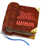
Description: A few people have submitted sphere versions of a logo, so I thought I'd give it a go whilst I mustered up some courage to try something artistic. I also thought I'd upload a version without a shadow as sometimes it's more appropriate for a logo.
Nice book but the words are hard to read —The preceding unsigned comment was added by 66.32.73.13 (talk • contribs) . Please sign your posts with ~~~~!
The rendering and quality of the image is simply great, very nice work, but I do agree that it is hard to read. --Cizagna(Talk) 17:59, 9 January 2007 (UTC)
Love this favicon image. It's very clean, and colorful. The leaves seem like a nice reference to the leaves in the Dofus logo, as well. Nice work. Aerate 23:37, 17 January 2007 (UTC)
That second one is amazing. Much clearer. And I really like the favicon too. //Peettalk | mod 19:43, 9 January 2007 (UTC)
I like the second one alot, its different from most of the ones above, because its not trying to look like dofus. Masshuku(Talk) 05:55, 11 January 2007 (UTC)
I really like this one, but still think that the Dofus carton is better because it connect more with the game itself--ilmarine 06:40, 14 January 2007 (UTC)
Votes for Wikibook and Favicon
Favicon --Cizagna(Talk) 06:54, 18 January 2007 (UTC)
I rather like this one. The dofus font ties in well, and I love the fact that it is actually grabbing one of the letters. This is my new favourite. Only problem I can see is that it is a late entry - if the public vote ends today, not many people may have had a chance to see this. PresqueVu(Talk)
No, the public vote will start today, in the night i will set up, what it ends today is the chance to submit your art. --Cizagna(Talk) 13:08, 17 January 2007 (UTC)
That makes much more sense. Thank you for clearing that up. PresqueVu(Talk)
Erg i forgot submission ended on Jan 10, i have been so busy and barely no one voted, so i guess i will change the dates like i have just told as im going to put a voting --Cizagna(Talk) 13:29, 17 January 2007 (UTC)
Votes for the Tree
1 Vote --Cizagna(Talk) 06:55, 18 January 2007 (UTC)


